Website Custom software · B2B

Dark, conversion-led site for a software studio

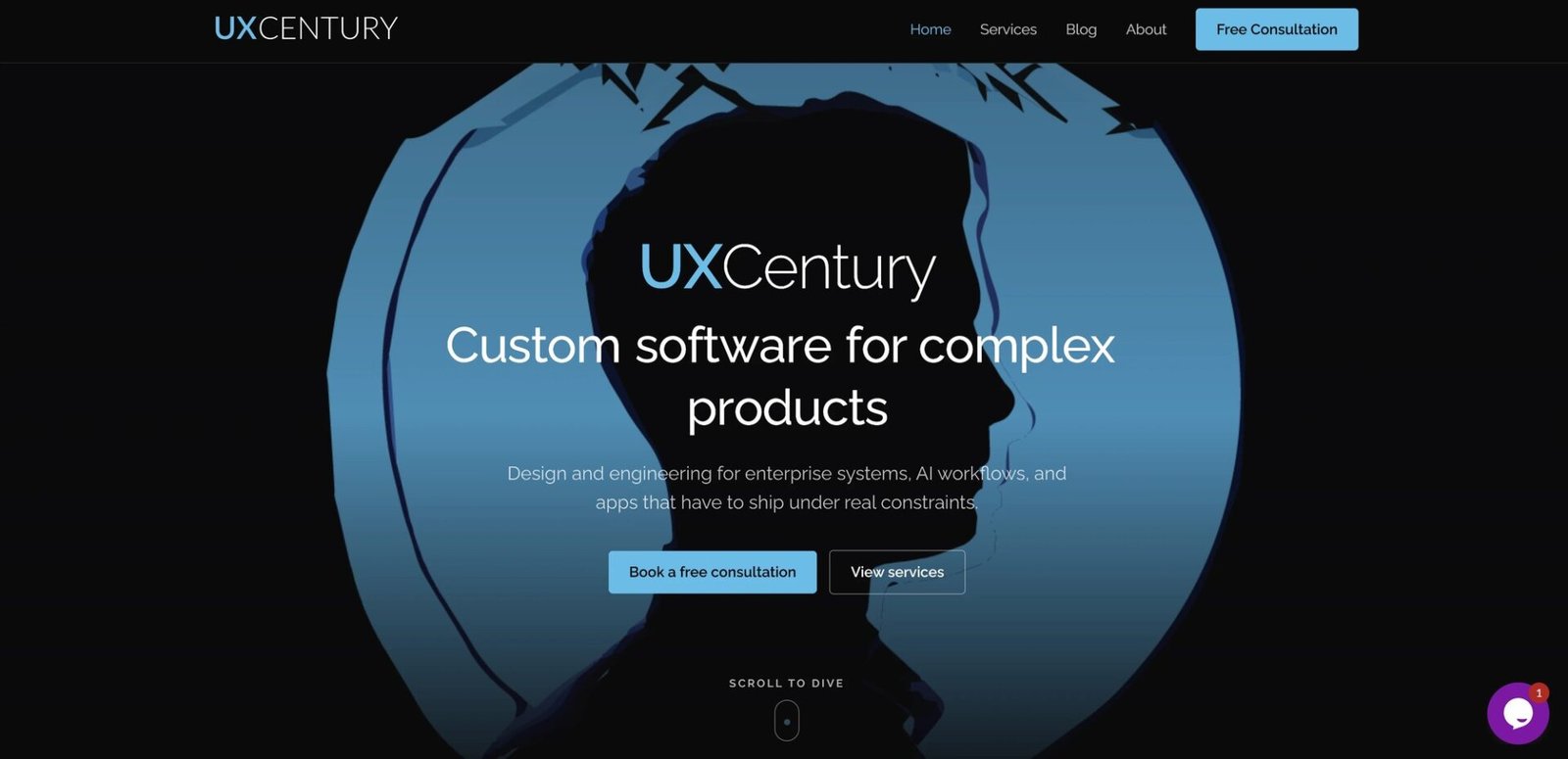
The offer reads in one screen - booking a consultation is the clear next step.

Dark, conversion-led site for a software studio

Challenge

Many software-studio sites feel generic: crowded navigation, vague claims, and CTAs that do not point to a real next step.

What we did

  • One hero composition: brand + outcome headline + dual CTA.
  • Services as a short, scannable list - scoped to ship, not slide decks.
  • A clear delivery path visitors can follow without digging.
  • High-contrast dark UI with a single blue accent and room to breathe.

Outcome

The offer reads in one screen - booking a consultation is the clear next step.

Ready to ship a clearer site?